VIRGIO
Transitioning from a Fast Fashion to a Circular-Conscious Fashion Brand
A UI/UX case study on re-designing the digital experiences for VIRGIO’s mobile and web platforms.

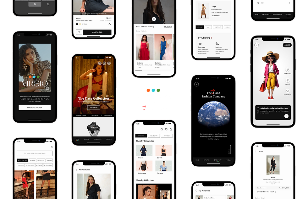
Overview of the new app design (version 2.0)
About VIRGIO
VIRGIO is a D2C fashion brand launched in 2022, which provides trendy yet affordable clothing for Gen Z and Millennials.
Founded by Amar Nagaram, former CEO of Myntra, the brand wanted to transition from a fast-fashion model into a "sustainable" model, due to the growing global awareness and environmental impact of fashion.
My Role
I was responsible for leading a small team of 3 designers in re-designing VIRGIO's mobile app and website. I took charge of the research and ideation phases, providing design guidance and closely collaborating with different teams.
In the final stages, I worked independently on major designs for both the web and mobile experiences, including creating a new design system from scratch.
Additionally, I played a key role in defining the new visual and brand identity for the brand, which was developed entirely in-house by our team.
My Role
Research
Ideation
Prototyping & Testing
Visual Design
Brand Identity
Tools
Figma
FigJam
Whimsical
Adobe Photoshop
Adobe Illustrator
Adobe After Affect
Team
3 Designers
1 Product Manager
1 Content Writer
2 Marketing Experts
5 Developers
Timeline
3 months
Problem Statement
The existing VIRGIO fashion app and website are designed to support a fast-fashion business model. This included features that emphasised on the following:
1. Frequent collection launches,
2. Rapid production,
3. Discount and offers,
4. Low-cost, high-volume sales.
This leads to over production, wastage and unsatisfied customers with below average garment quality. These elements conflict with the principles of a circular-conscious brand, which focuses on sustainability, building long-life garments, recycling, and ethical practices.
Therefore, a comprehensive redesign of our digital presence was essential to align with the new sustainable mission.
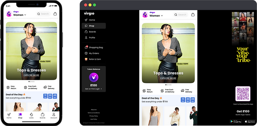
Version 1.0 (mobile & web experience)
"How might we build a shopping platform to better showcase our sustainable products, and build trust among the users."
Business Goals
1
Seamless Transition of the Brand Positioning
Transitioning the users' perception of the brand from a fast-fashion to a sustainable brand, which included redefining the visual language and identity of the brand.
3
Educate and Inform users about Sustainability
Educate and Inform users about the benefits of circular fashion and motivate more users to adopt circularity practices. Promote users engagement with storytelling.
2
Optimising the Experience of Web and Mobile platforms
Re-design the website and mobile app with a focus on offering intuitive and engaging shopping experience to cater eco-conscious consumers.
4
Build Trust and Advocacy for the new brand
Develop interactive features that promotes customer engagement and builds trust for the brand. Develop community-focused approaches to build loyalty among customers.
Understanding the Problem
One-on-one session with internal stakeholders
Before jumping into the solution mode I wanted to understand the problem better and what could be the best place to start but with the internal teams that you are working with.
I started by talking directly to different teams in the company and understanding their side of the story and what are the problems they felt were critical. This gave a clear picture of the present situation and also highlighted areas that needed improvement.
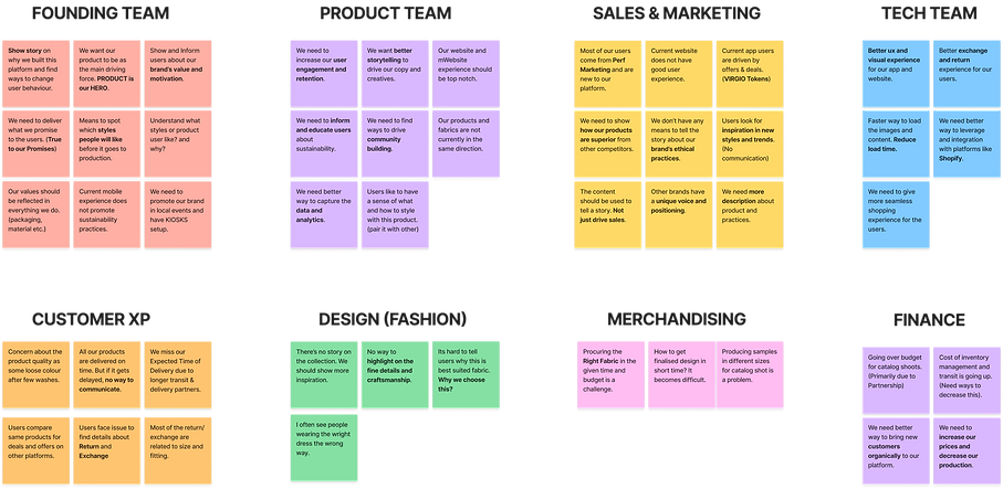
Understanding the existing problem areas in the app and web
After that, I used data from Mixpanel, to analyse the current performance of the mobile app and discovered that product exploration and post-order experience were the areas of major concern for the business.
With the help of the Product team, I understood which features were working for us and which were not.
I also looked into the existing web experience, and tried critically analysing the problem areas. I discovered that sub-optimal web experience was a another major concern for the business, resulting in friction and drop-off.

Empathising with the Users
Collecting existing user's feedback
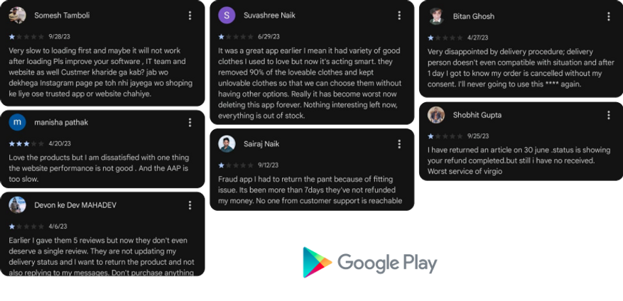
After that, I analysed the current experience of the mobile app and the website. I collected customer feedback from the Google Play store for the last 3 months and grouped them together.
A major concern that I discovered from the data was issues with garment quality and sizing, which resulted in user dissatisfaction for the products. This increased the volume of return and exchange requests, and a bad experience with order updates and customer support led to user mistrust for the brand.
Understanding our new users
We conducted a Focus Group session with 18 female participants, who shopped regularly from VIRGIO. The main focus of the session was to understand their perception and preferences towards sustainable fashion. In this interactive session, we showcased VIRGIO's new direction and took feedback.
I then selected a few candidates who had earlier shopped from a sustainable brand and conducted a User Interview session, to understand their motivations and problems.

Key Highlights & Summary
1
Users are willing to pay a premium amount if they feel they are getting a premium experience
Users feel the prices are reasonable if they get a good shopping experience. “A better version of product for a better version of me”.
3
A good design aesthetic and experience makes a brand stand out & trustworthy.
A clean design and premium shopping experience helps to build trust in new users and can make it stand out against the competition.
2
Users like to make informed buying decisions when shopping from a sustainable brand.
Users are mindful of the impact of their choices and seek transparency to understand how their purchases contribute towards a positive change.
4
Storytelling can motivate users to buy products, and also leaves a memorable & captivating experience.
Users are driven by emotions and storytelling can play a big role in nudging users to buy products. Also, it is fun and easy to consume.
Defining the Problem space
Affinity Mapping
I then conducted an affinity mapping session along with other designers and product manager. This session allowed us to group our findings and identity themes.
We identified 6 Themes:
-
Dislikes & pain points
-
User Types
-
User Wants
-
Likes in Sustainability
-
Shopping Decision
-
Garment Details
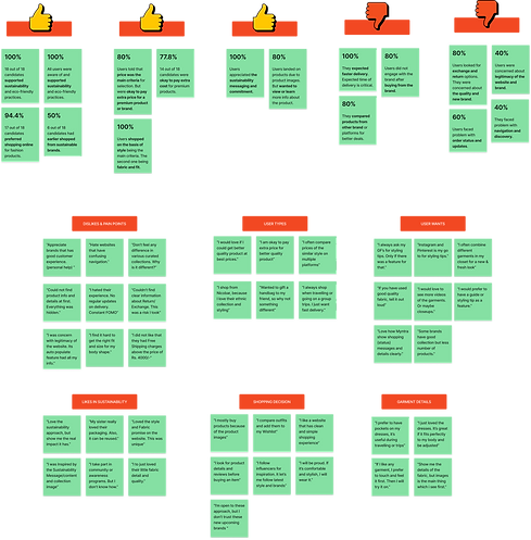
User Personas and Journey Mapping
Taking to our customers and understanding their needs helped me to create these new user personas that best suited our sustainable model. These new personas, Explorer and Environmentalist, helped me in my new design direction.

Ideation and Brainstorming
Exploring the opportunity areas
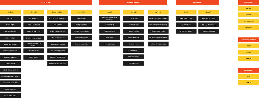
I then started ideating on different possible solutions along with the design and product team. Using the journey map and user personas we expanded on all the opportunity areas. Diverging our thought process allowed us to come up with various possibilities.
We then bucketed them under these 3 parameters, Storytelling, Convenient shopping and Engagement.
#1
Storytelling
Inform users about the brand, its products & practices.
Inform, Educate, Motivate, Brand building
#2
Convenient Shopping
Experience to help users make decisions.
Assist, Suggest, Support
#3
Engagement
Features that will keep users motivated & build a relation.
Trust, Loyalty
Brainstorming ideas and approaches
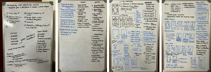
I then got into the brainstorming phase with other members of the team. I used Whimsical to collect all the points and looked into them individually using a mind map. I then started looking into all the flows, such as Onboarding, Signup, Product Details Page, and Shopping Bag and using simple wireframes tried to map these out according to the ideation notes.
I then used these wireframes to have a discussion with the development team early on in the process and started taking feedback on the user flows. This helped me to identify all challenges early on in the design process.

Prototype and Final Designs
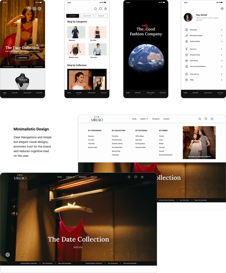
#1. Shopping experience with a Minimalistic Design.
Thoughtfully crafted designs focused on simplicity and ease of use, featuring minimalistic design principles, intuitive navigation, and seamless experience across platforms.
High-quality images and interactive elements enhance product exploration, while clear navigation and elegant visual storytelling reducing cognitive load on user's decision making.

#2. Engagement with the product, before and also after
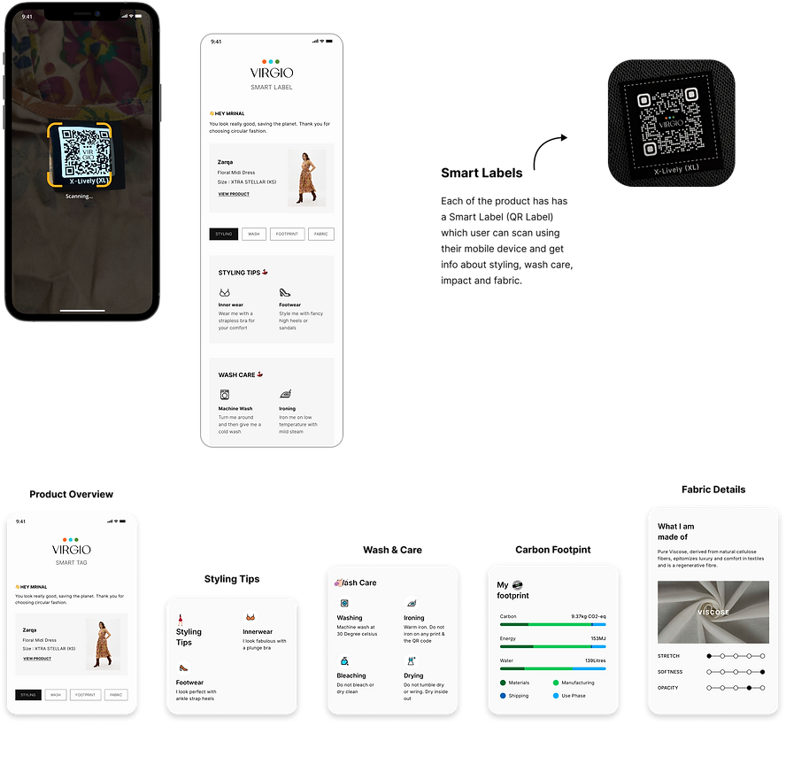
Smart Garment Labels present on each VIRGIO garment allow users to scan for details about the product directly from their mobile devices. A digital label that makes life easy for the user by giving all the important details of the garment with just a scan.
It replaces the practice of adding 4-5 tags on the garment and makes it easier for the user to keep track of Fabric Details, Styling Tips, Care Instructions, and also Carbon Footprint.

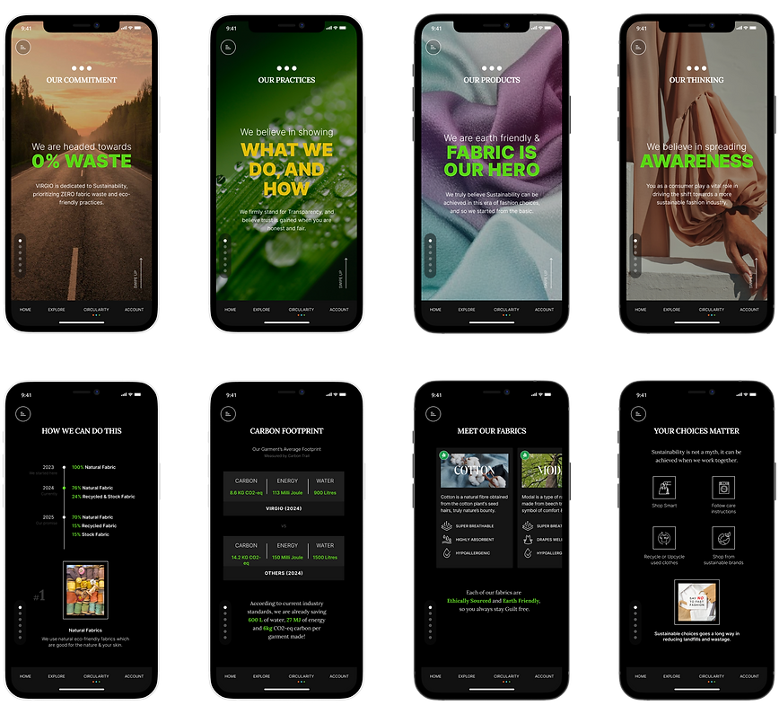
#3. Immersive storytelling that motivates & inspires
Sustainability section was tailored designed to engage and educate users about circularity, sustainable practices and the brand’s values and commitment.
Prioritising mindful consumption of content and information, the section was designed for immersive storytelling. A simple swipe & view behaviour to educate & inform through immersive storytelling


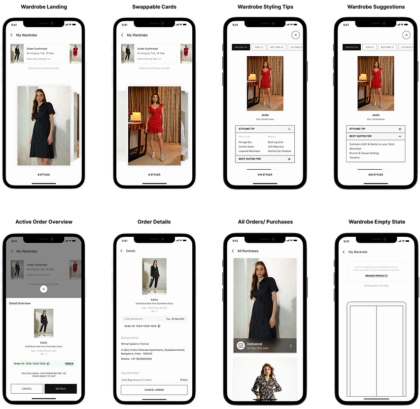
#4. Digital Wardrobe with styling tips and suggestions
Digital Wardrobe designed to remove the boring, mundane experience of orders in a typical e-commerce platform. This section replicate the user's actual physical wardrobe in a digital space and give suggestion on what to wear and when to wear from the list of products bought.
An immersive card experience, with styling tips and ease to track active orders that are still to be added to their wardrobe.


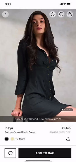
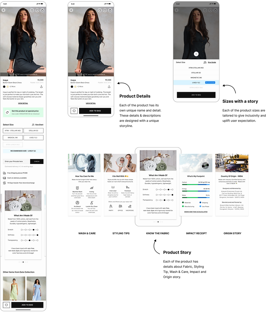
#5. Unique & transparent way of product storytelling
Product story on the PDP page was designed with a minimal design principle to motivate users to make informed buying decisions. Designs that prioritise detailing and transparency with product stories.
Each product was “personified” and given a unique name similar to the traits of any individual. Each garment's sizes are also designed meticulously to promote inclusivity for all body types.

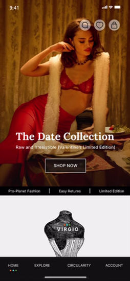
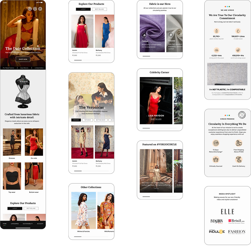
#6. Browsing and discovery of products with ease
Dynamic widgets created for Home Page, prioritising high-quality images, and videos to narrate the brand's sustainability journey and emphasising product exploration.
Stories that indulge users in the motivation and inspiration that went into creating that particular collection. Progressive disclosure of products which allow users to browse the collection and products on the Product List Page.


#7. Virtual look & feel of the products and garments
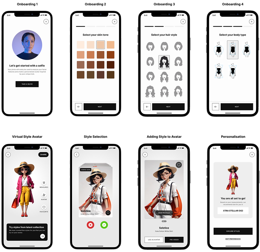
Virtual Dressing Room designed to motivate users to make informed buying decision and increasing user engagement. The idea was to convert some of the upcoming styles into virtual styles using Clo3D.
User can create their Avatars, and try new products from the collection on their personalised avatars. Users can set them as their favourite avatar styles and share with friends.


Other Deliverables
User Flow, Information Architectures and Design System
Along with the final designs I also played a key role in other important deliverables such as User Flow and Information Architecture.
A major challenge was working on a new Design System, which needed constant updates and adaption during the course of the whole design process. But, this helped the design and development teams to get a seamless and uniform design language across all verticals and platforms.

#1. User Flow
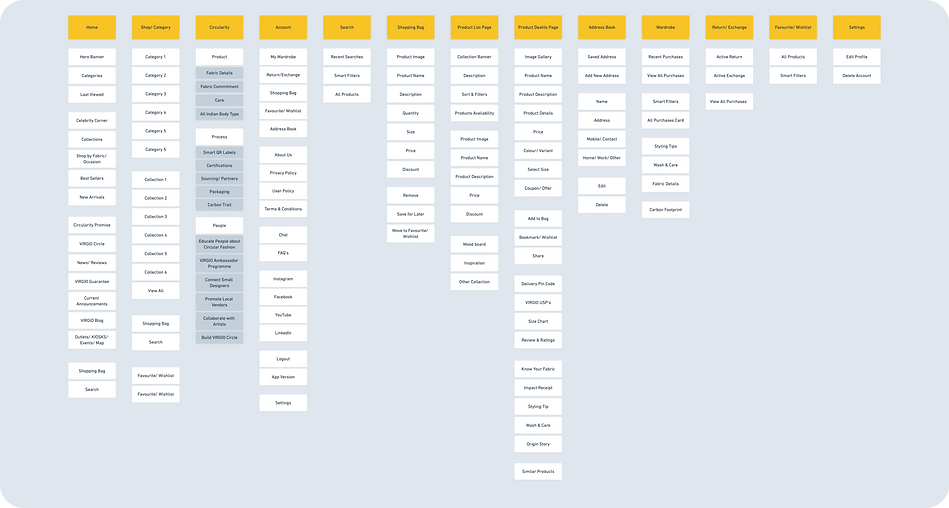
#2. Site Map
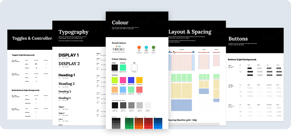
#3. Design System
Highlights and Learnings
Key Higlights
-
My team successfully launched VIRGIO in UAE, and made it an international sustainable brand made in India.
-
My initiative laid the foundation for a premium sustainable brand in India, by delivering a new visual language and identity of the brand.
-
I successfully delivered a scalable Design System for app and web platform, which significantly reduced the development effort.
Challenges and Learnings
-
User research revealed interest in sustainable choices, but cost and accessibility are barriers. Crafting user-centered experiences for web and mobile was challenging when it came to educating and motivating users on sustainable fashion choices.
-
Working closely with product, engineering, and marketing teams ensured our designs aligned with VIRGIO’s mission. This collaboration enabled faster iteration and a more cohesive brand experience.
-
Managing a small design team demands clear communication and precision under tight deadlines. Emphasising tech feasibility and adaptability was crucial for our design direction. I divided our approach into phases, focusing on educational content and transparency first, then introducing community-driven and interactive elements for ongoing engagement.
-
Building a brand identity that aligned with VIRGIO’s sustainable mission involved extensive research into premium visual languages. Through iterative testing and feedback, we created a cohesive visual identity that felt both world-class and authentic, using earth tones, natural textures, and minimalist design elements to evoke a sense of eco-conscious luxury.
-
Designing for circular fashion required a departure from conventional e-commerce practices. We introduced features like product lifecycle tracking for transparency, and early concepts for experience stores through kiosks and small retail spaces. These physical touch-points complemented the digital experience and helped build a deeper emotional connection with users.